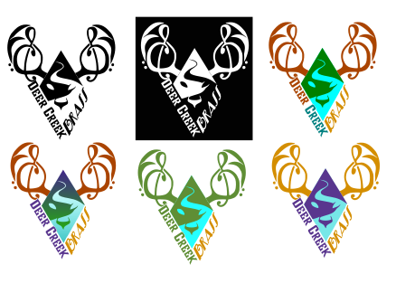
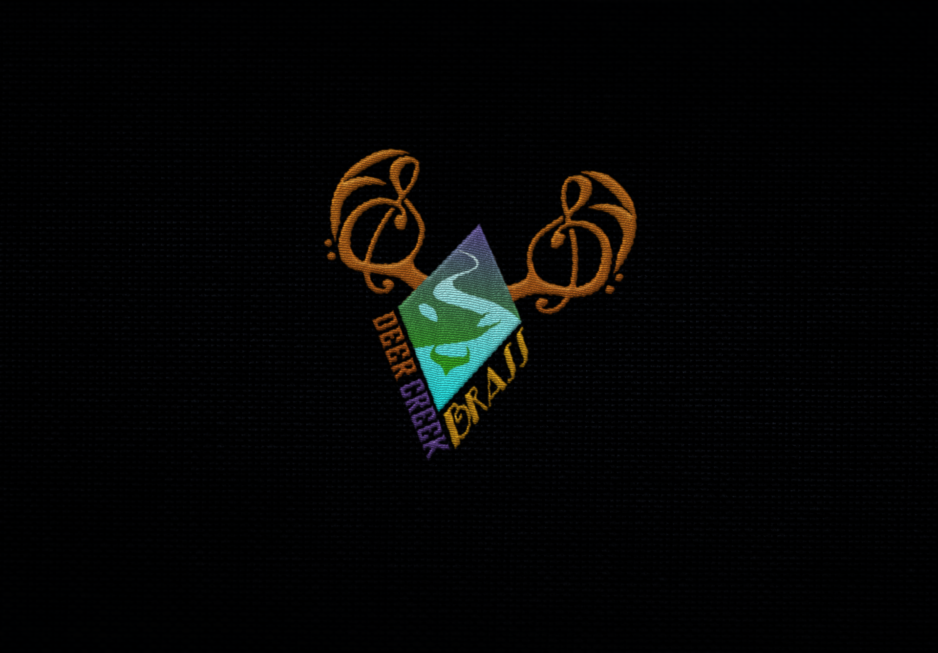
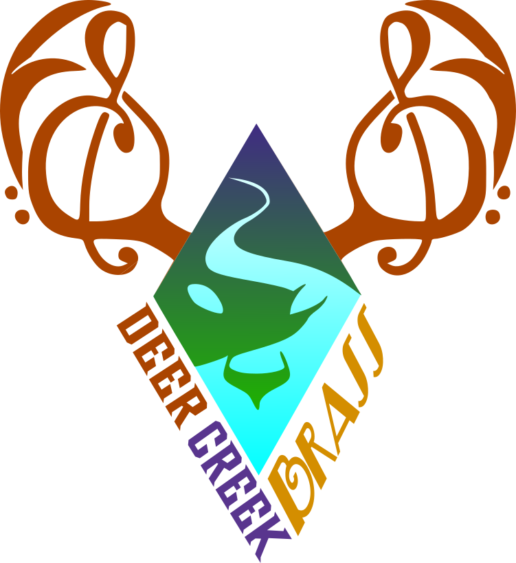
For this project, I worked with a small-town brass ensemble called Deer Creek Brass. With minimal direction from the client, I had the freedom to explore creative ideas, making this a particularly enjoyable design process.
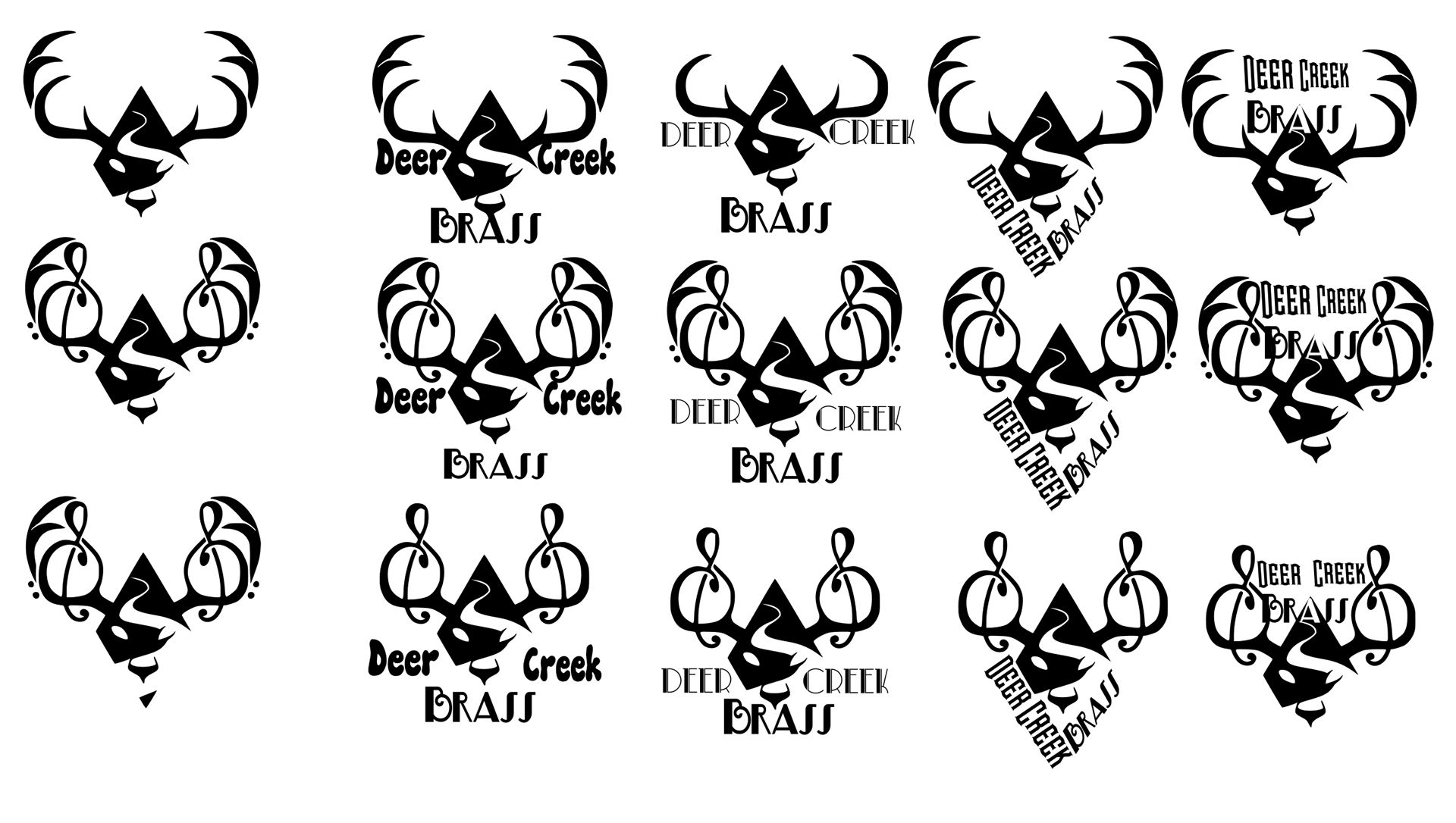
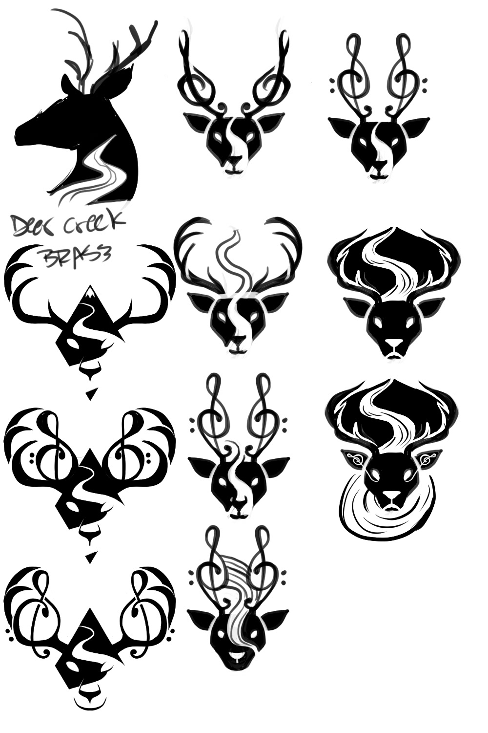
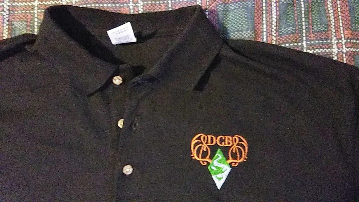
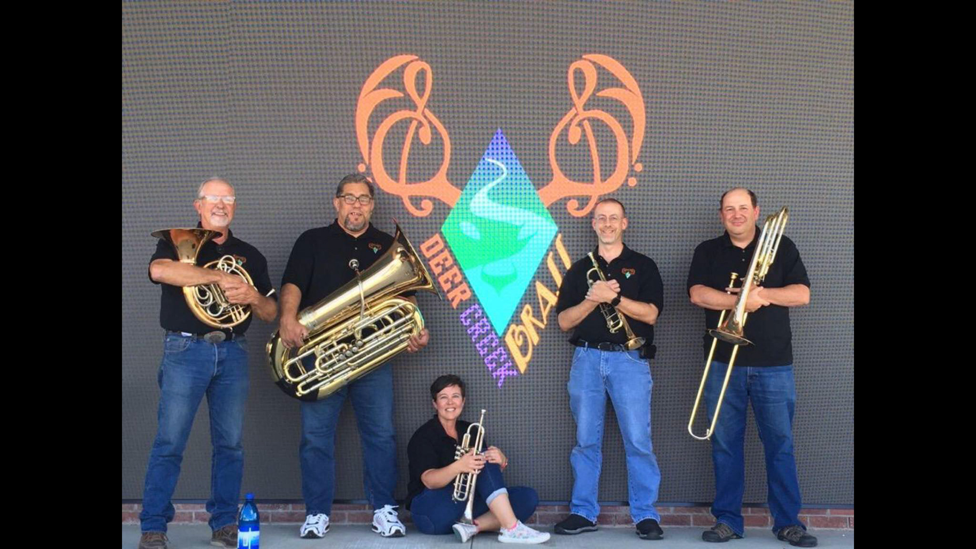
At the bottom, you can see my sketch phase, where I experimented with shape language and negative space to capture the ensemble's essence. The final logo was designed for versatility, as it would be featured in promotional materials and embroidered on concert attire. To accommodate these uses, I created both gradient and flat versions of the logo to ensure it worked beautifully across all applications.
The Sketching Phase in my Design Process