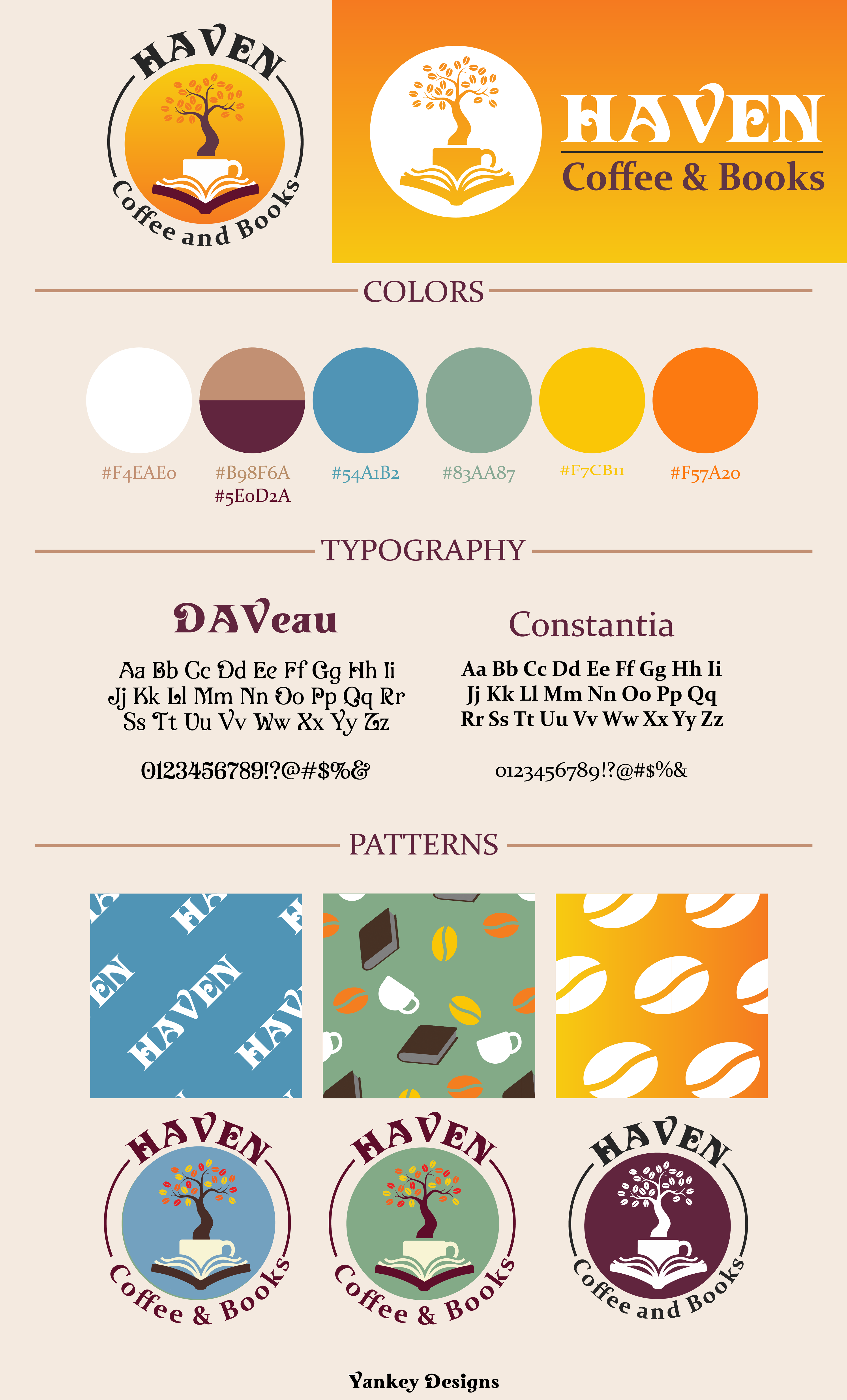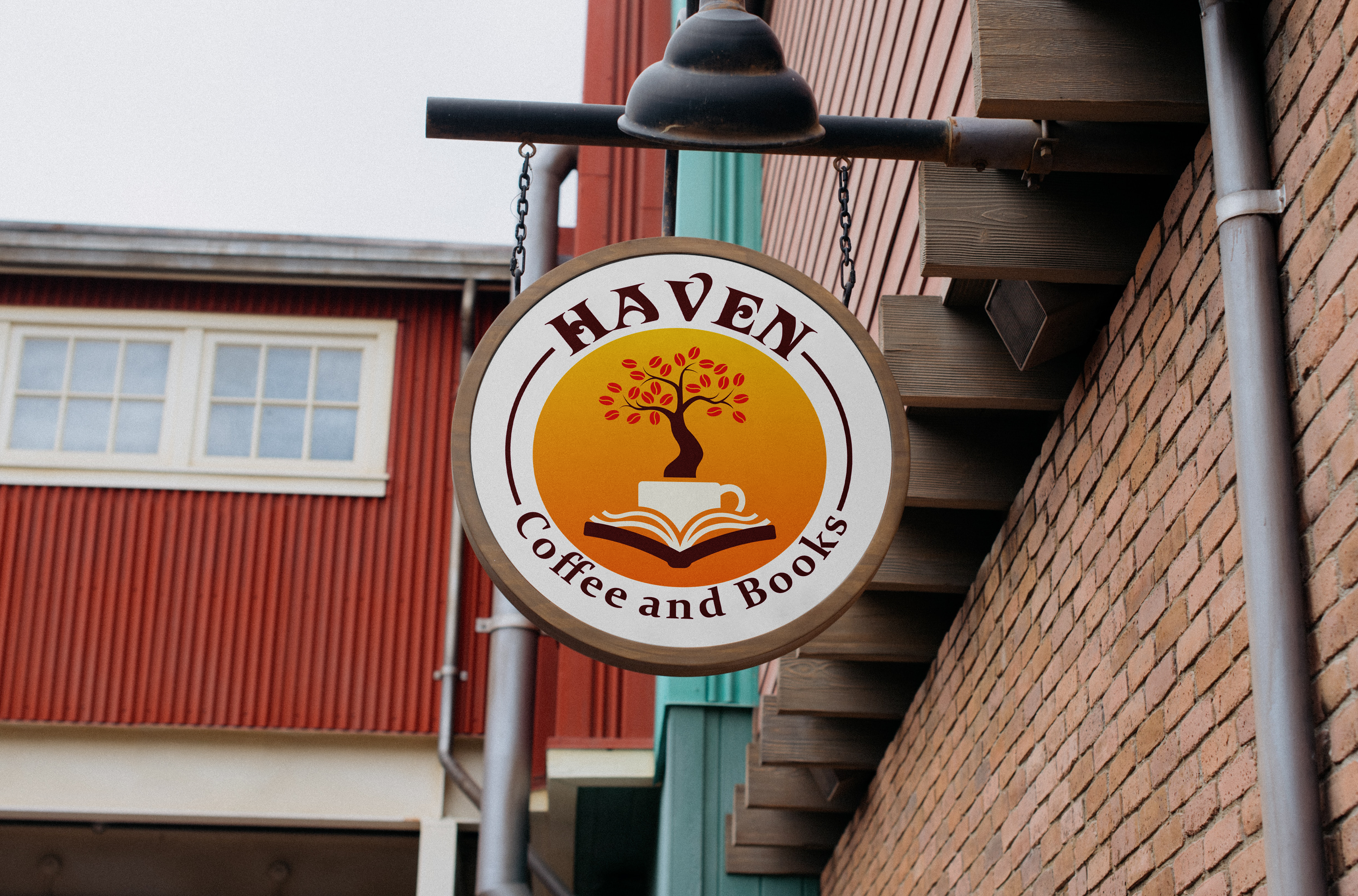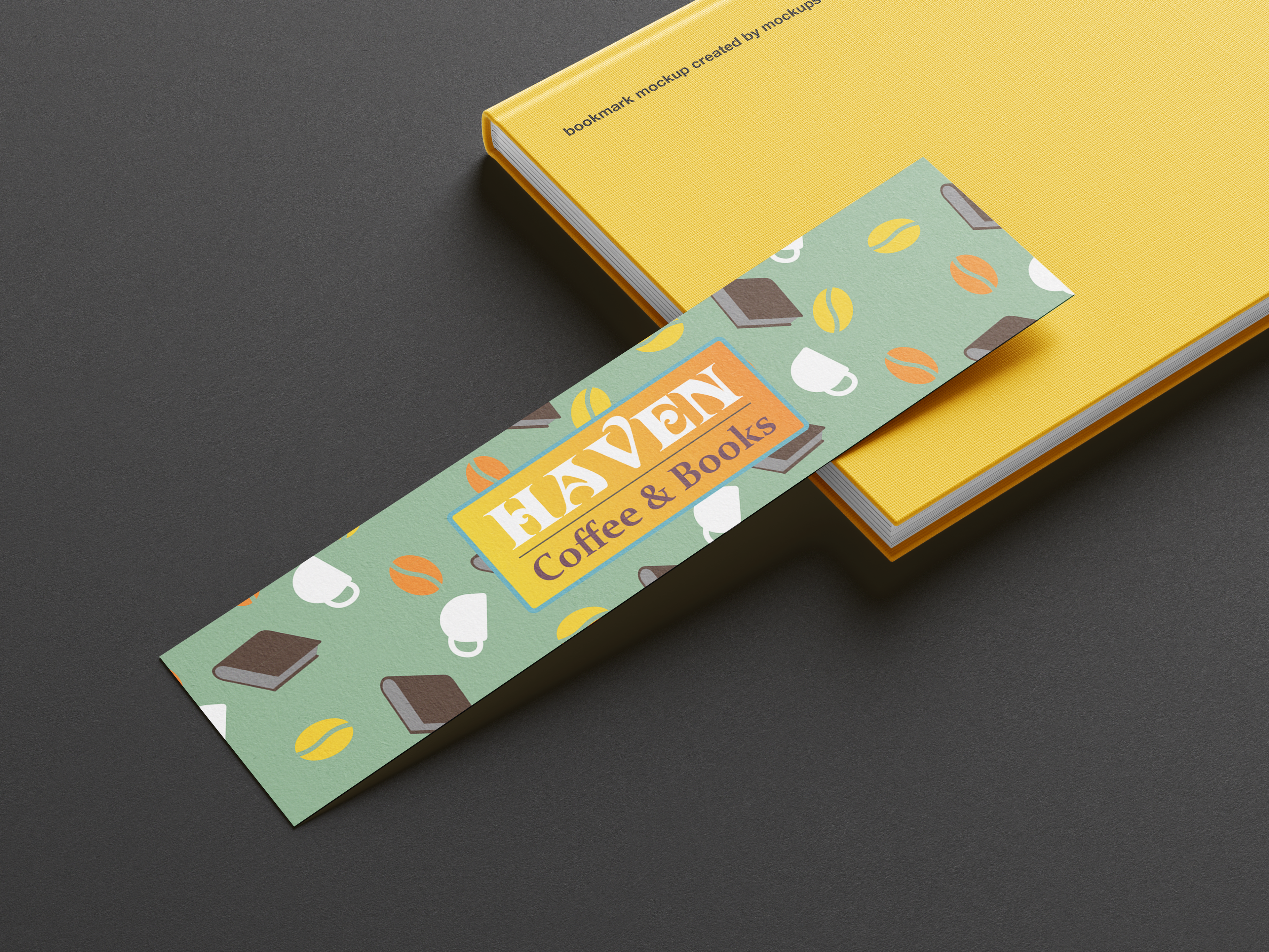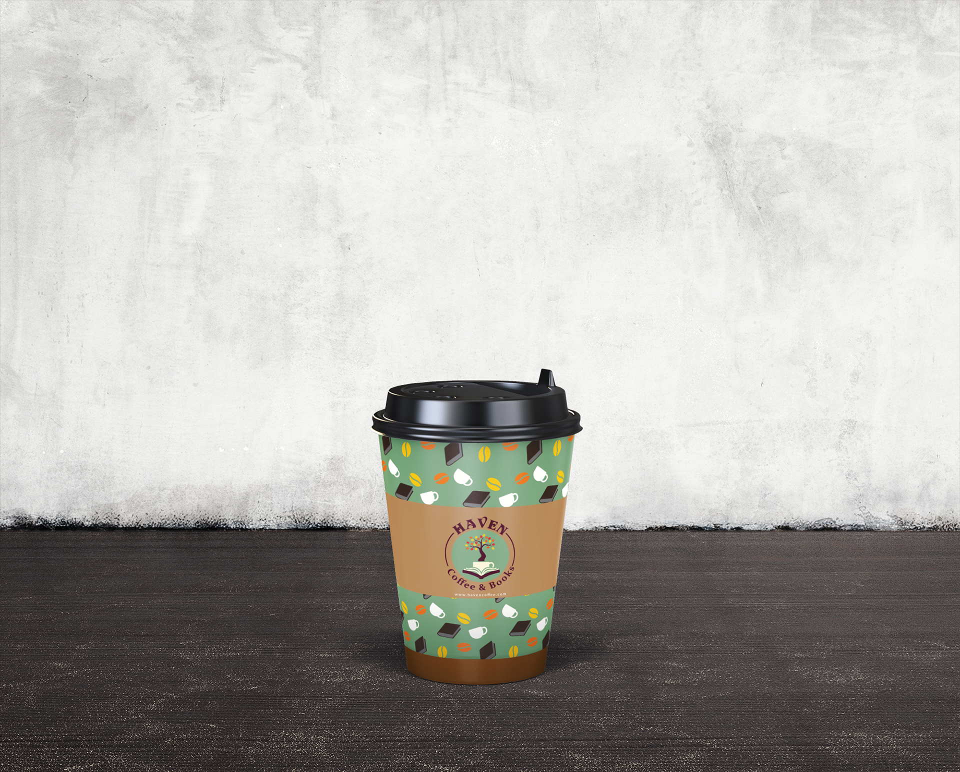
For this project, I designed a logo for a local coffee and bookstore. The original concept featured a detailed, painted tree growing from the pages of a book. To capture the client’s request for autumn-inspired colors, I created a palette of sage, orange, and muted blue, providing multiple options to suit their vision.
I also introduced a gradient variation that the client loved, reserving the muted fall tones for use in lower-budget applications when gradients might not be practical. The final design strikes a balance between warmth and versatility, perfectly reflecting the cozy vibe of the shop.