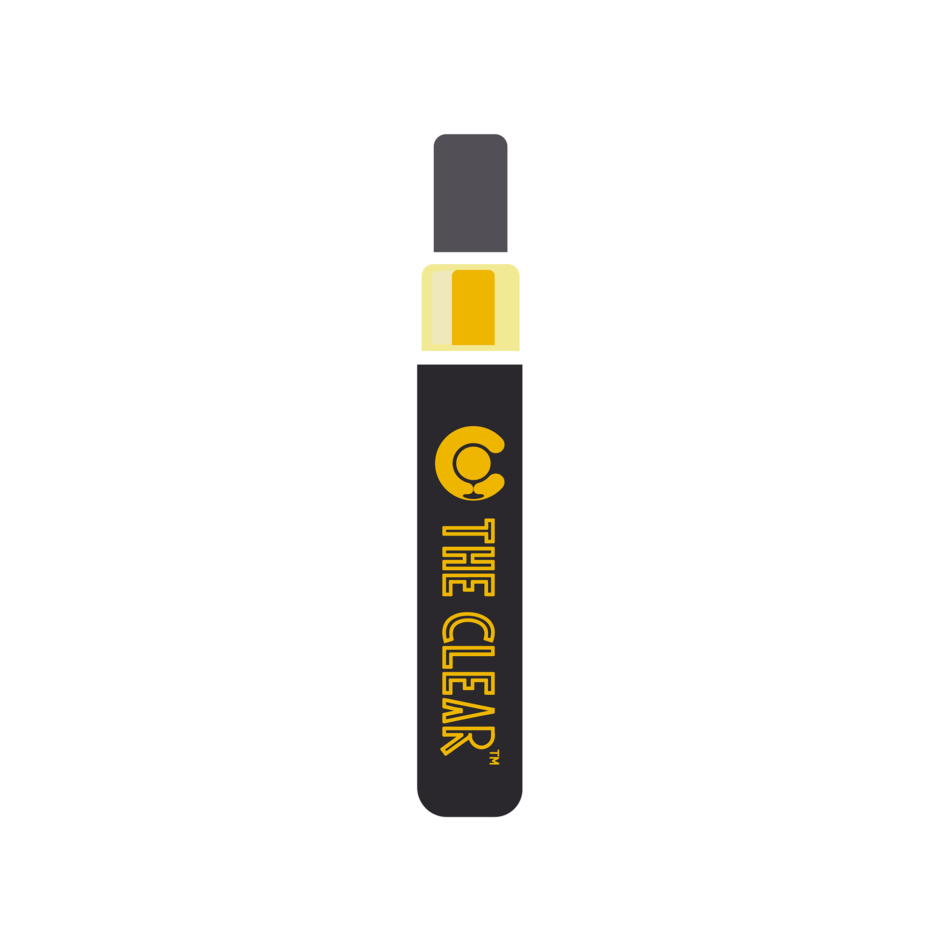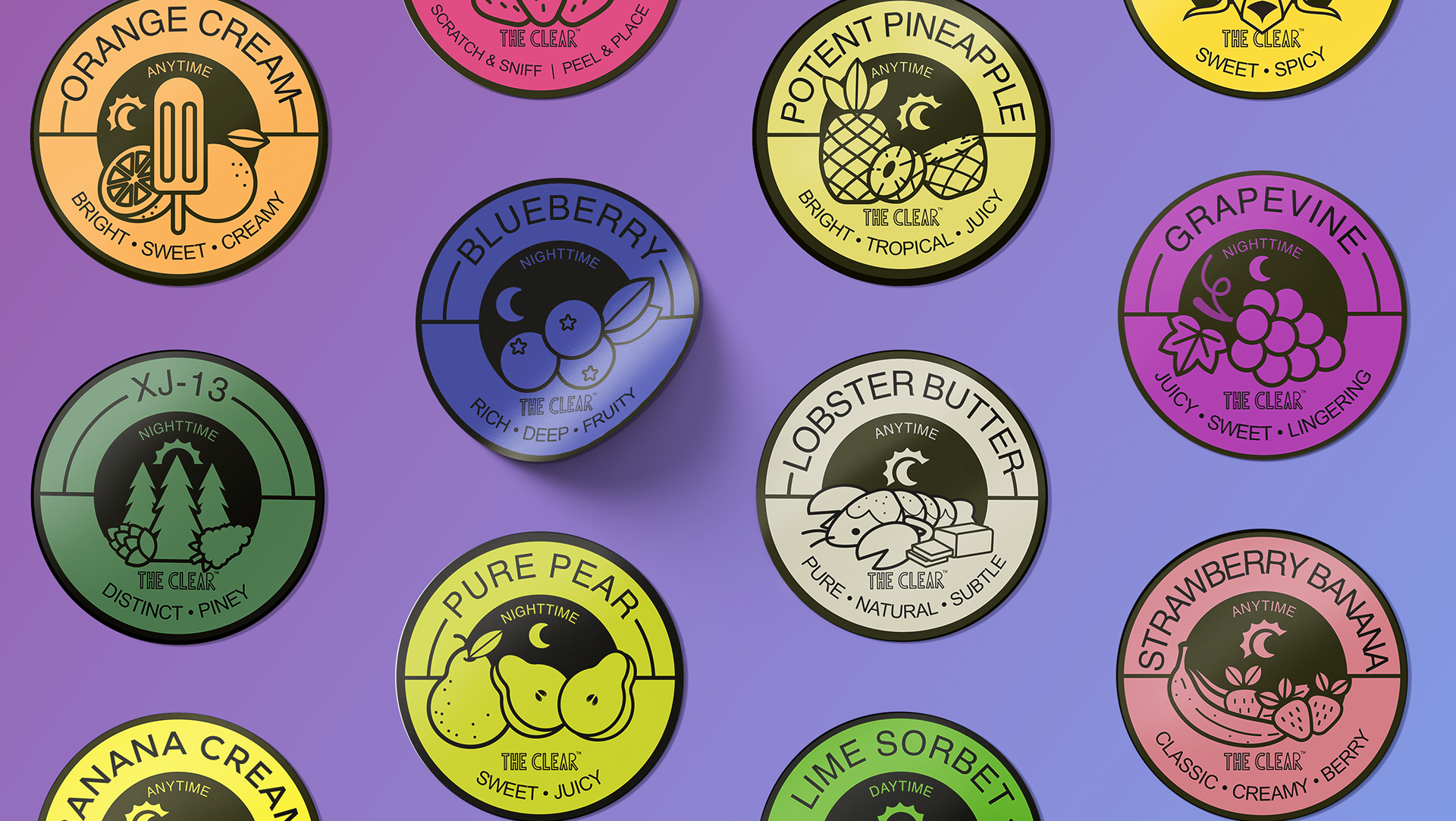
During my internship at The CLEAR, I designed promotional materials to showcase all 15 flavors available in their product line. My focus was on maintaining consistency in color, typography, and layout across all company collateral to create a cohesive and polished look.
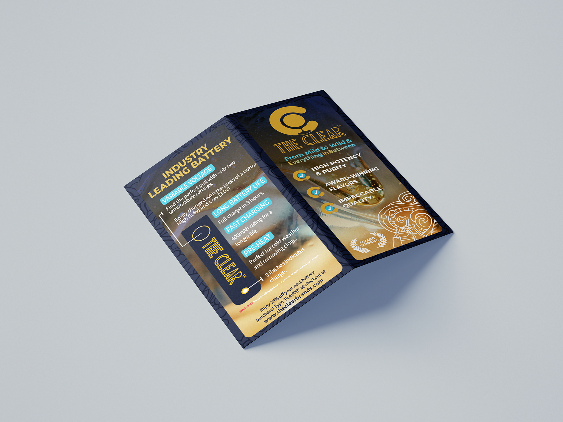
One key deliverable was a small card to include with products, giving customers a quick overview of other flavors to try. While working on this, I identified a common pain point from the sales team: customers often struggled with properly charging the battery product. To address this, I incorporated a clean, easy-to-understand infographic on the back of the card to improve the user experience.
Additionally, I designed a sleek bent metal display stand that aligned with the branding, tying all the elements together into a functional and visually engaging promotional package.
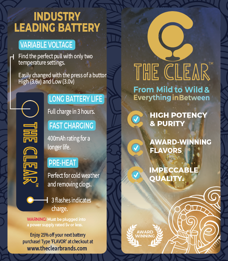
The front and back of the card
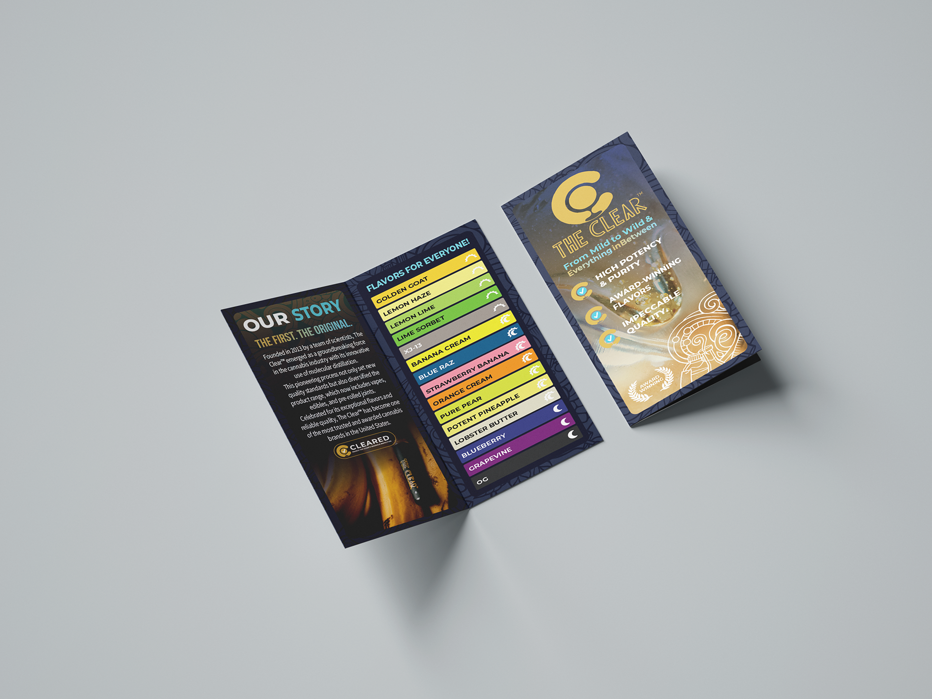
The mockup I designed to show the card in action
The interior mockup
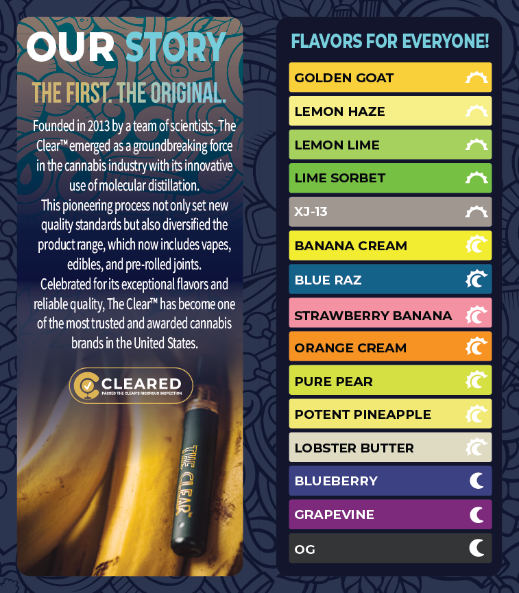
The interior featuring the company's brand story and the 15 flavors.
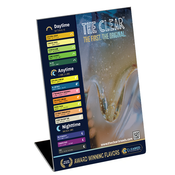
The bent metal display mockup