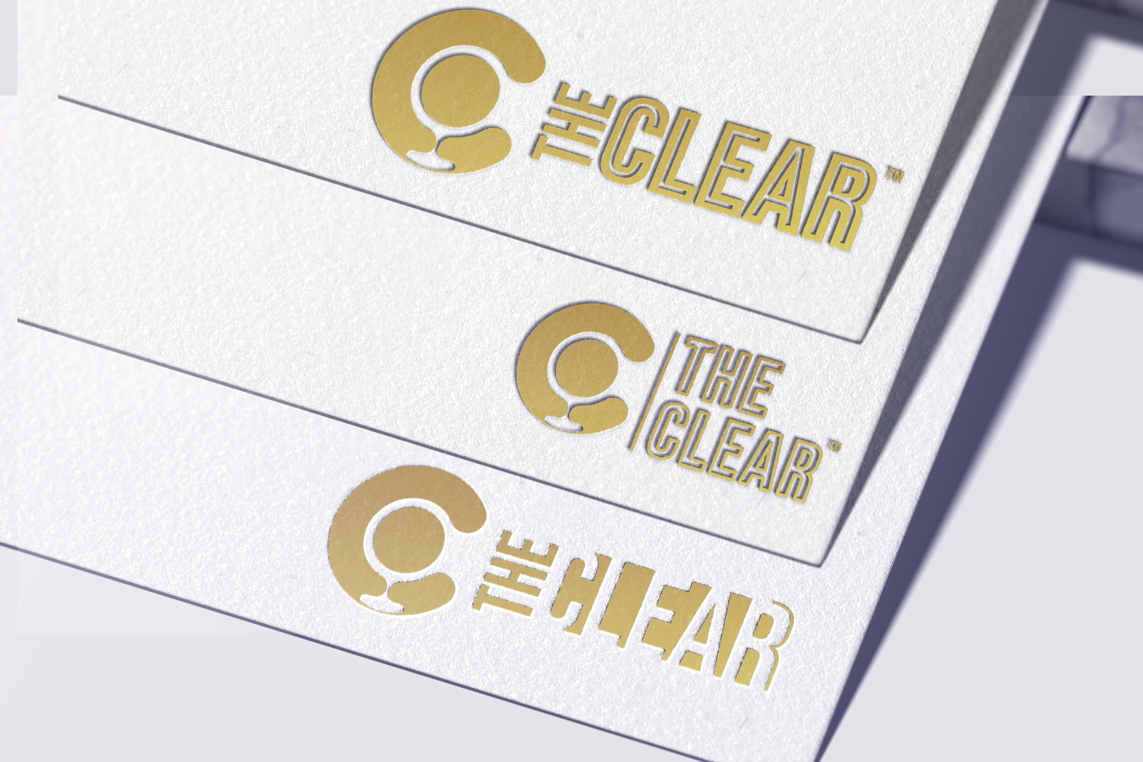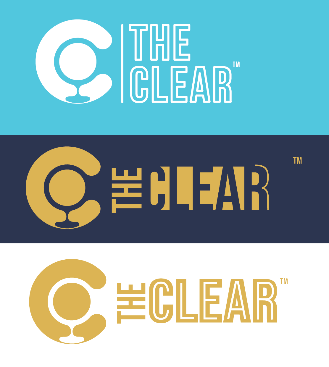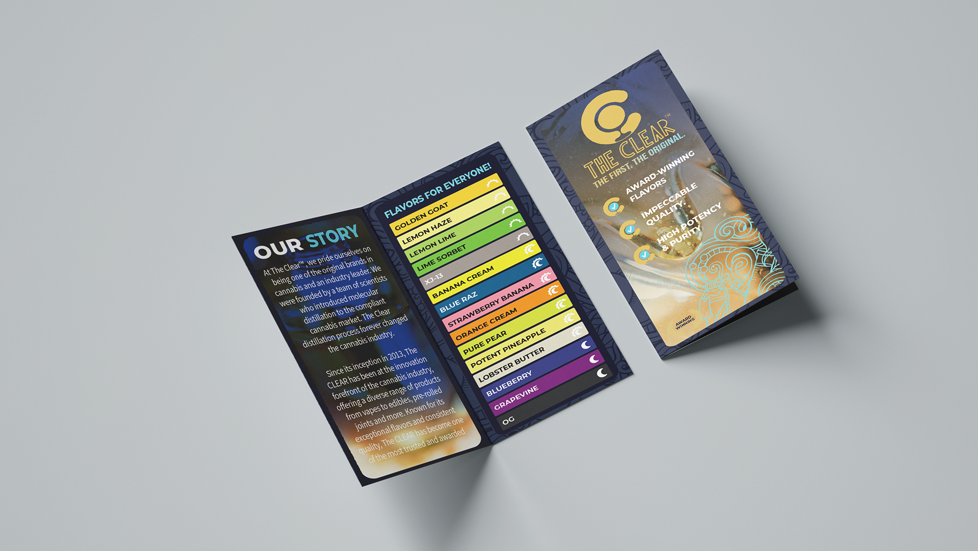
During my internship at The CLEAR Brands, I was tasked with refreshing the company’s logo while preserving its core identity. Since there was some internal hesitance on making changes, I focused on maintaining what made the logo unique while refining specific elements—particularly the "A" and "R" in the wordmark.
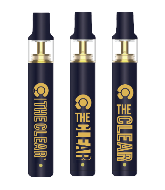
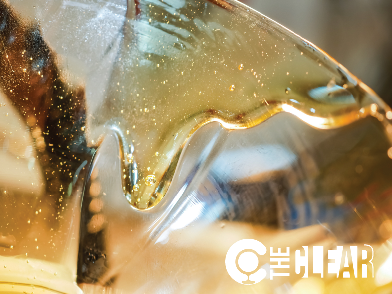
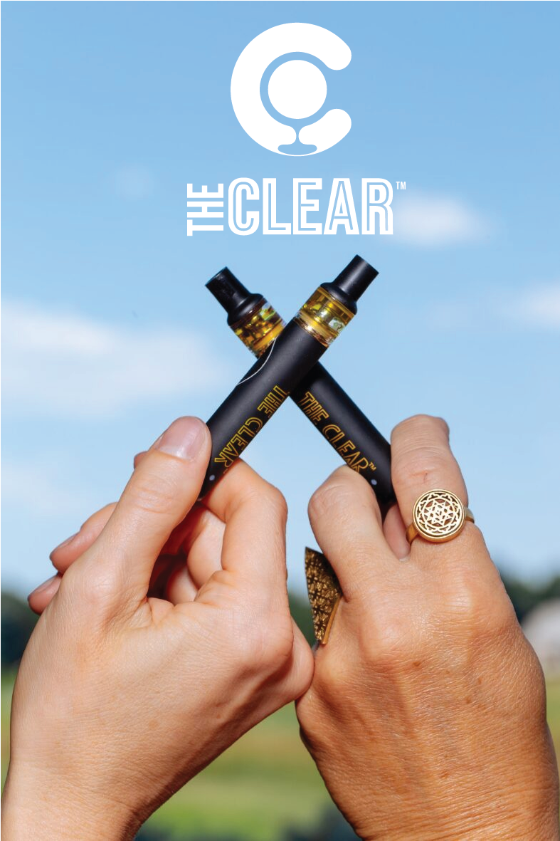
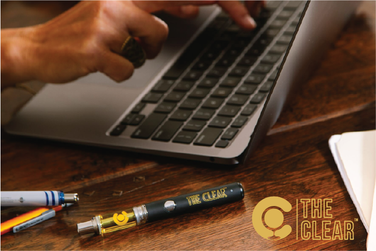
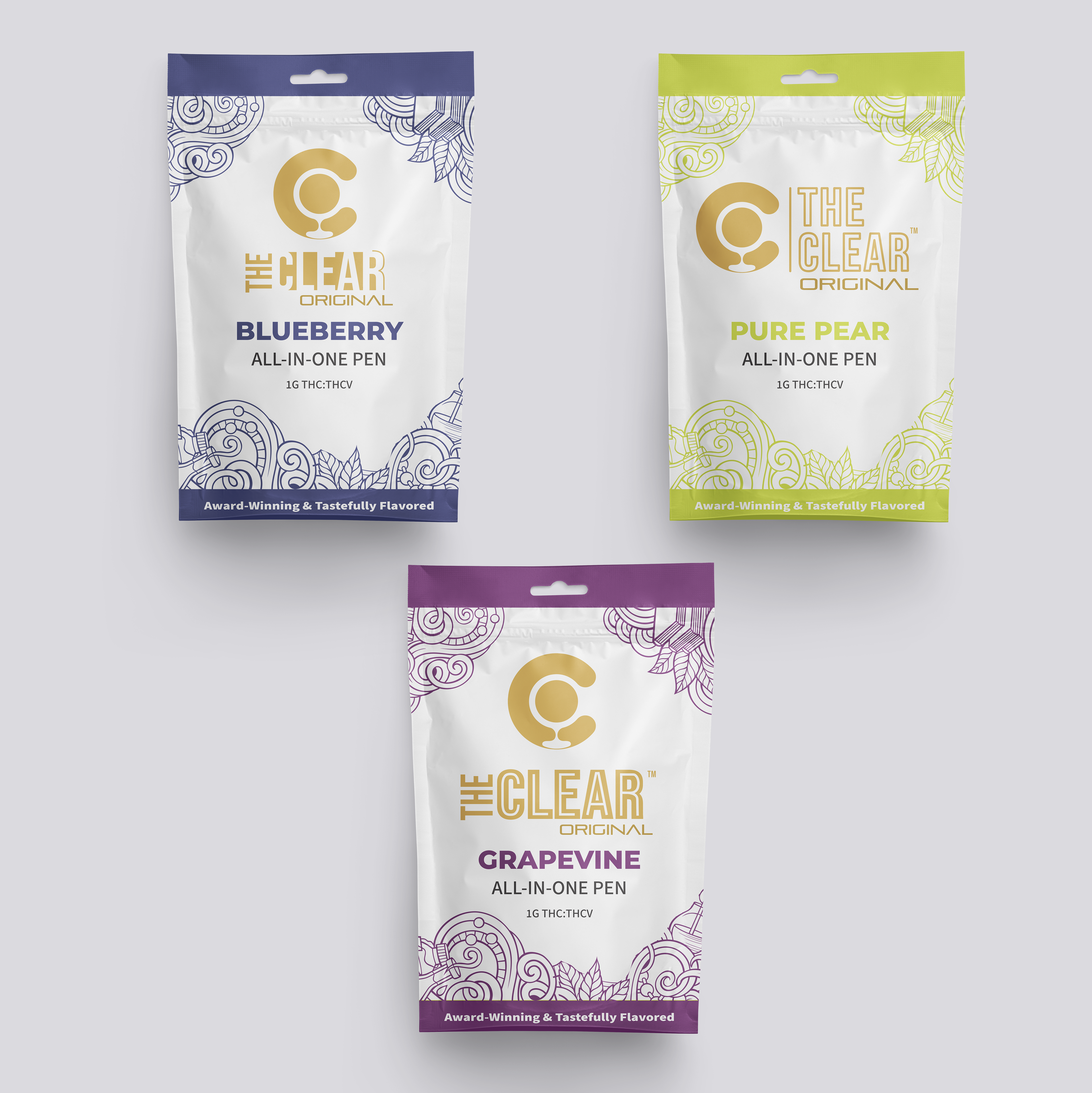
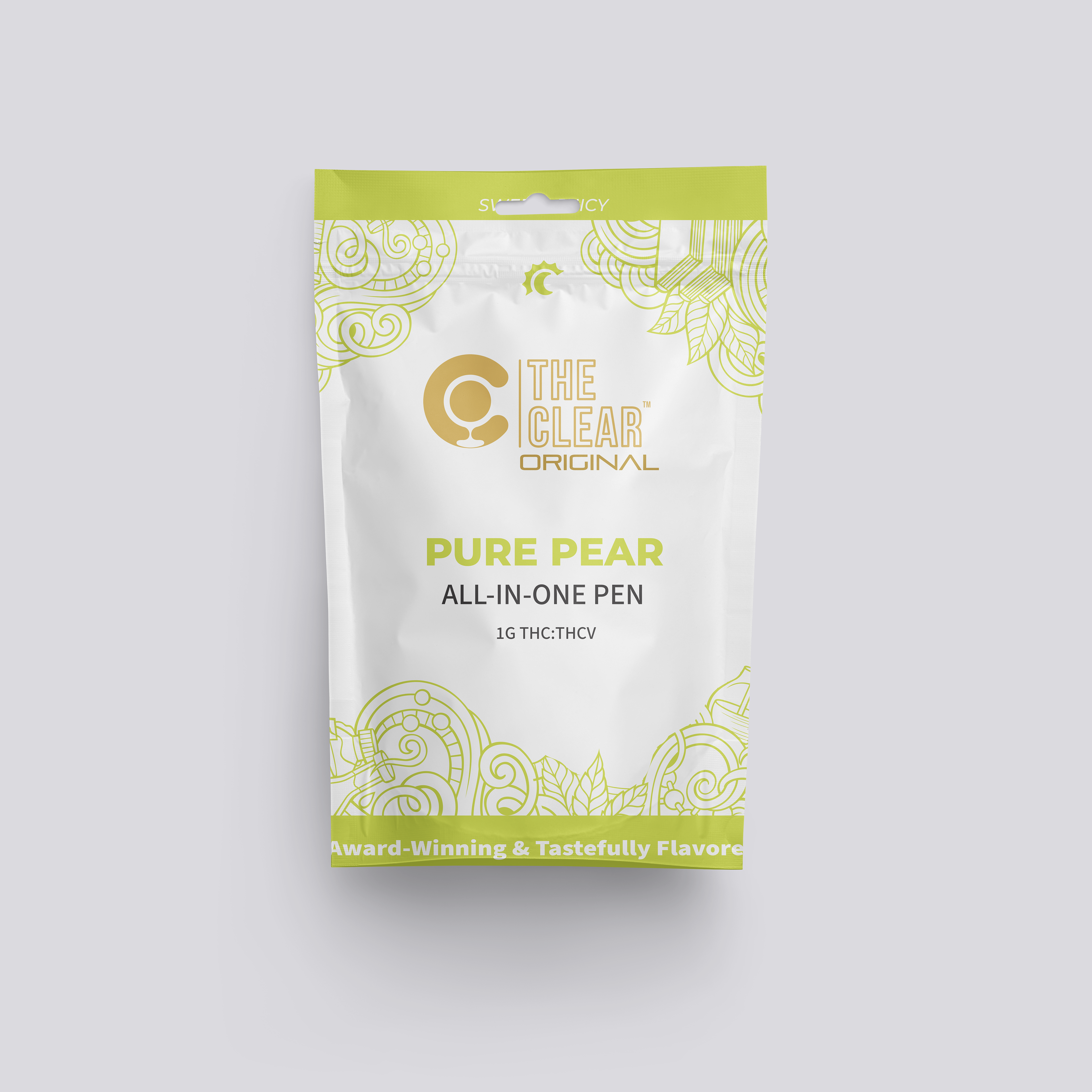
I created two versions that incorporated outlines to maintain the original logo’s “clear” interior, which I felt aligned well with the brand's name and values. For a more creative approach, I also designed a version that emphasized negative space, making the letters themselves appear “clear.” To demonstrate versatility, I placed each version in company collateral and as mockups for the products, showcasing how the logo could seamlessly integrate into collateral and visual branding.